Boero Red. A synthesis of energy in the brand.
Maybe it was 1956: difficult for the children of the protagonists to remember, because they were both very small at the time. It was certainly the time of two beginnings. Sitting at one of the small tables in the old streets of Genoa were Ettore Veruggio, one of the pioneers of advertising art, founder of the historic Firma agency and centre of gravity of a collective of illustrators, and Federico Mario Boero, who had asked his friend how to illustrate in a few lines the synthesis of the things he believed in.
The aim was to frame the family name in a trademark that would remain impressed in memory and also remind those working on the project where they had started from and what they needed to preserve.
“Help me give a sign to how I know how to make paints” – this is how Beppe Veruggio imagines the conversation between his father and Federico Mario Boero, the third generation of the family, who took the decision to build a brand and launch the company on the mass market.
A well known and tasty form, familiar and simple.
The result of this creative exchange was affectionately known as the “formaggino“, because its shape resembled a triangle softened by the edges, like those creamy slices wrapped in silver paper and placed in a round box. A well known and tasty form, familiar and simple.
Gruppo Boero and the swan symbol.
The swan symbol, which still represents Gruppo Boero today and tells its identity, bore several messages: a black swan recalled, by contrast, the pure white of white lead, the first Boero manufacture which was the basis (long since surpassed by innovation) for every colour, the elegant shape, symbol of beauty, and the link with Genoa, of which the swan, according to the legend of Cignus, founder of one of the oldest peoples in Europe, was an emblematic symbol.
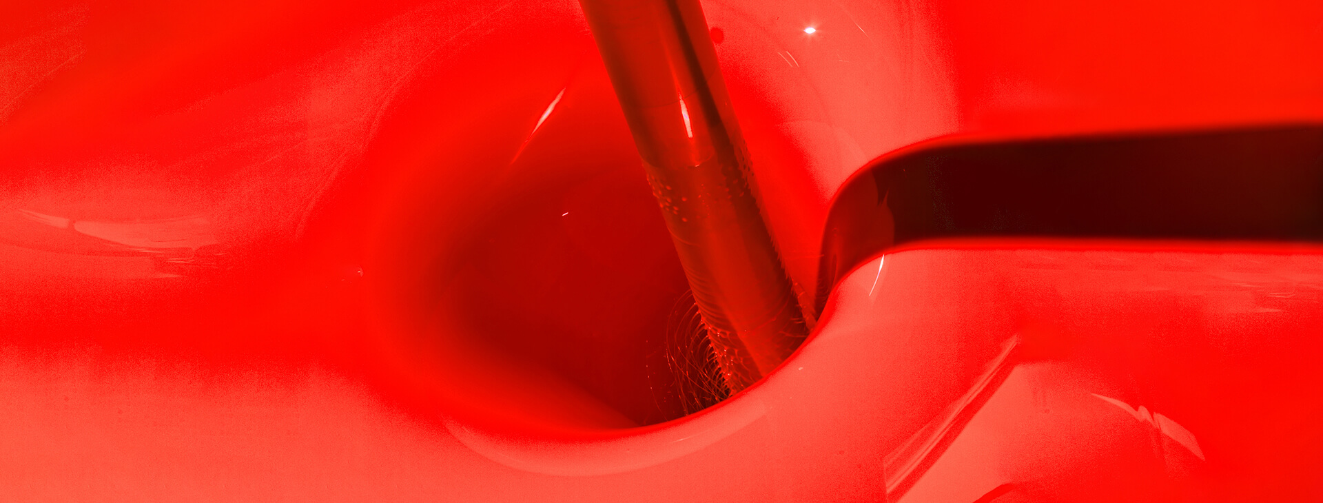
Boero red in the official logo.
Ma è il rosso Boero che ancora oggi colpisce lo sguardo e attira l’attenzione. Rosso: un colore
But it is the Boero red that still catches the eye and attracts attention today. Red: an energetic, vital colour, a call to action. It is the colour of concreteness, understood as dynamism, the emblem, for many theories of colour, of the origin of something new, which concentrates creative power.
That red was the official colour of the brand registered in 1968. Although there have been many variations of the logo (from the original white, to orange, to green and to blue) only that Boero red has attracted the attention and built the trust of many generations of professionals: red was a synonym of quality, reserved for a period to high-end products, the most performing and technically innovative ones.
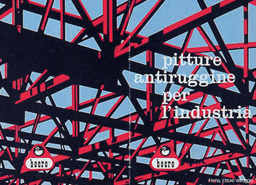
The use of red and black bands.
There is another feature that has marked the history of the brand and which, though abandoned for a short time, has been recovered: the red and black bands that accompanied the logo. A combination that perhaps drew on classical inspiration, on the Greeks’ love of bright, solid colours in contrast, particularly red combined with black, as seen in ceramics, and also in statues and temples.
In Boero’s packaging those bands created a harmonious contrast with the grace of the swan framed in its emblem: a characteristic of the packaging abandoned for a short time but then brought back to satisfy the many requests of those who were by now fond of that style, demonstrating that every choice is a dialogue with customers.
“My father cared a great deal about those bands,” recalls Andreina Boero, guardian of the Group’s memory and today Honorary President of a company that has become international but is careful not to lose its core values. “They represented an easily recognisable guise and therefore a form of courtesy for the customer, whose need not to waste time in choosing, to go for sure, had to be respected.It was a way of being found when you needed us and you knew you wanted to choose us”.
There is a lot of memory in that brand which still today transmits the enthusiasm of the beginnings, when creativity was discussed sitting at a table, to create something memorable and recognisable.
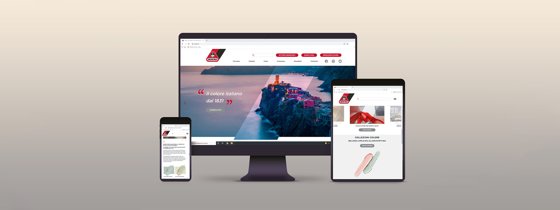
The new Boero website
Many things have happened under that sign and today many more are beginning: in January 2022 the new Boero website will go online, a new point of contact with professionals in the sector. An easy-to-navigate, exhaustive and content-rich site telling the story of the red thread that links the many moments of a long history, born in 1831 and dotted with anecdotes.
That thread also has the same energy as in the early days, the iconic Boero Red, the signature we put on every project.